

At my last medical checkup, the doctor gave me the usual once-over. Blood pressure…”Good,” he said. Heart… “Can’t hear anything strange.” Lungs… “Breathe deeply, please.” Liver… tap-tap-tap… “Seems OK.” What my doctor did was systematically follow a well-established process. First, he looked at the measurable ‘vital signs’, then – through blood tests – he took a closer look to make sure there was nothing lurking somewhat deeper likely to cause trouble.
As business managers, this is surely what we need to be doing. We should be checking the ‘vital signs’, and then, if necessary, probing a little deeper. Have you identified the ‘vital signs’ of your organisation? Its ‘pulse’, ‘blood pressure’ and ‘lung function’? Not only do you need to identify these, you must also decide how often they need to be checked. In the business jargon of the day, a report that delivers this sort of information has become known as a ‘dashboard’.
A management account is not a dashboard. A management account is more akin to the service record of your car, which has no earthly use when it comes to providing an early warning system of looming trouble. A service record will never warn you of a potential overheating problem, for example. But a well-designed dashboard report will. That’s the difference. But the development of a good dashboard report that alerts you to the first sign of ‘overheating’ somewhere in the business is no easy matter.
A well-designed dashboard only feeds through information that’s vital for the purpose required. The more complex the organisation, the more complex the dashboard. It’s like comparing a light delivery vehicle with a combine harvester or aircraft.
Golden Rule 1
Dashboard design requires identification of those few critical items that signal the health of the organisation.
Dashboard designers are passionate devotees of the 80:20 law, and focus entirely on the 20% of issues which deliver 80% of the results. A dashboard isn’t cluttered with ‘good news’ numbers. It’s an exception-based report, drawing attention to problem areas.
Golden Rule 2
Keep it simple. Complexity adds hours to the preparation time and to the overload of useless information. However, it’s no simple matter to simplify – and strike the right balance. You may need expert help here.
Golden Rule 3
Build a highly disciplined system backing delivery of these reports. Information may be needed from widely spread sources, and the system needs to extract this information in the right format to the right person on time. Dashboards cannot work ad hoc.
Golden Rule 4
Report against a comparative. It may be the target, budget, last week or last month. Some numbers need no comparative to make sense, but most gain much more information content when reported against a comparative.
Golden Rule 5
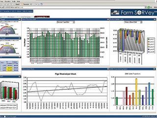
A picture is truly worth a thousand words. Make use of graphs, histograms and other gadgets in the report as they are so much easier to follow. Note the example provided. Obviously, it has been reduced in size, but doesn’t it catch the eye – and deliver information in a style which really communicates? Developing a good dashboard is not an event, it’s a process. As you use a dashboard report you will find ways to perfect it. Build one now. It will change the way you run your business.


